
Horizon Design System
Strategic Thinking | Exec buy-in | Team Empowerment | SYStems Design | Accessibility | Localization
Case Study: Elevating brand trust, user engagement and efficiency at scale through Chegg’s Design System
Discover how I led a dynamic team to develop our strategic design system, which boosted user engagement, and enhanced brand trust, fostering team collaboration and achieving 72% adoption, delivering a seamless and accessible user experience.

Built to scale, the Horizon Design System prioritized accessibility, usability, and a bold new brand identity with over 1000 components.
Project snapshot
As Senior Product Design Manager, I led a cross-functional team in rebuilding, rebranding, and implementing Chegg's design system with a user-centered focus. The Horizon Design System tackled brand inconsistencies, reinforced Chegg's empathetic, student-first identity, and evolved to support the company's transition to an AI-powered, personalized learning experience. By fostering collaboration and empowering my team, we ensured the system's scalability, accessibility, and alignment with business goals. The outcome was a robust component library made up of over 1000 components that streamlined product development, supported marketing efforts, and empowered product teams to build cohesive, impactful user experiences.
Leadership Highlights
🎩 Wearer of many hats: Led the design system project from inception to implementation, balancing roles as Design Manager, Product Manager (defining the product vision, managing the roadmap, and prioritizing features), and Project Operations Manager (overseeing project timelines, resources, and cross-functional coordination).
💡 Strategic vision: Spearheaded the creation of a robust, flexible design system and rebrand supporting long-term business growth.
💪 Team empowerment: Fostered a culture of collaboration and ownership, leading to high-impact design solutions.
🤝 Cross-functional leadership: Collaborated across design, engineering, marketing, and product teams.
🚀 Driving adoption: Advocated for the system through education, executive buy-in, and strategic roadshows.
📊 Measurable impact: Enhanced design consistency, efficiency, and reduced development cycles.

Collaborators behind the Design System's success.
Role: Senior Product Design ManageR
Team: Cross-functional team of 4 Product Designers, 1 Content Design Manager, 1 Accessibility Program Manager, 1 Engineering Manager, 2 Front-End Engineers, 1 Mobile Engineer.
Partners: Product Managers across multiple product squads, Product Marketing Managers, Data Analysts, Creative Director, Research.
Stakeholders: VP of Product, SVP of Engineering, Director of UX, Senior Director of Research.
Supporters: The testers, feedback-givers, and brave guinea pigs who helped us refine our components and processes.
Context for the rebrand: Adapting to the pandemic shift

Before: Chegg's playful, cheeky, and vibrant brand felt out of sync with users navigating the pandemic and remote learning.
The pandemic forced a massive shift in student learning, underscoring Chegg’s need to adapt. As usage surged by 35%, Chegg’s brand—vibrant and playful—felt disconnected from the emotional needs of students. A redesign was necessary to foster trust, clarity, and support.
In 2020, Chegg's revenue soared 56%, with a surge in subscribers relying on its services—but the brand struggled to connect with users facing challenging emotions during the shift to virtual learning.
— Investors.com
We launched a rebrand balancing optimism with empathy, resonating with students' evolving needs. This transformation laid the foundation for the Horizon Design System, creating a scalable, cohesive design language to address immediate challenges and support long-term growth.
The challenge: Unifying a fragmented experience

User testing revealed 25% of students were confused by Chegg’s inconsistent branding.
The existing design system at Chegg was a solid foundation but had not been fully adopted across the platform. To address these challenges, I led a comprehensive audit to assess the current state of the design system and identify areas for improvement.
Audit Findings:
Brand Fragmentation: Multiple brand identities across Chegg’s touchpoints led to a disjointed user experience. The Chegg logo alone had three different versions in circulation, diluting the brand's consistency. User research revealed that these inconsistencies caused confusion, undermining trust and user satisfaction.
Technical Debt and Legacy Frameworks: Outdated systems and legacy code significantly hindered the seamless integration of the design system. Some older code was incompatible with newer React components, creating technical barriers and complicating the system's adoption and implementation.
Inconsistent Component Styling: Critical UI elements and page layouts lacked consistency across screens, disrupting the flow and creating an uneven, sometimes jarring experience for users.
Collaboration and prioritization
To ensure the Horizon Design System’s success:
Incremental adoption: I partnered with engineering leads to address backend issues systematically, starting with high-traffic screens where updates would have the most significant impact. By focusing on incremental adoption, we minimized disruption and maximized value delivery.
Prioritizing component creation: I collaborated closely with 6 Product Managers across multiple squads to understand their roadmap plans, feature work, and component needs. We categorized these based on priority, aligning with team requirements, and broader business objectives.
This feedback helped me create a detailed roadmap that balanced product needs with user requirements, guiding the system's evolution with a clear, actionable timeline based on the screens that were most visited by users.
Design meets business needs: Strategic opportunities for growth
Beyond solving immediate challenges, I identified strategic opportunities that would elevate the overall design system and create a powerful tool for our teams, and our users while ensuring scalability and long-term impact:
♿ Accessibility enhancements: Embed inclusivity as a core principle, elevating components to meet WCAG guidelines, making the platform usable for all students.
📝 Content design consistency: Standardizing UI copy and micro-interactions to align with Chegg’s tone of voice.
🌍 Localization support: Building flexibility to accommodate different language requirements.
🔮 Future scalability: Addressing technical debt and creating modular, adaptive solutions.
🌙 Dark Mode: Introduce dark mode to enhance user experience and reduce eye strain, catering to the 25% of students who engage in all-night study sessions at least once a month.
Accessibility, localization, and content design were integral considerations from the outset of each component's development. These principles were woven into the foundational documentation, ensuring they were consistently applied across the system. This approach not only served as a guiding framework for the design team but also became a powerful strategic tool to help all teams recognize the long-term value of Horizon and its impact on creating inclusive, adaptable, and user-centered experiences.

An introduction from the design system highlighting the importance of accessibility, with callouts emphasizing key areas to address for inclusivity

Standardized UI copy and micro-interactions aligned with Chegg’s tone of voice.
Solutions: Building the Horizon Design System
The Horizon Design System served both immediate and long-term needs. I led my team in designing flexible components, modular layouts, and standardized guidelines to ensure consistency across products while allowing easy adoption and customization.
With a clear vision and clean slate, I focused on ensuring the solution was strategic, sustainable, and actionable for both my team and cross-functional partners balancing ambition with feasibility. .

The name "Horizon" was chosen to reflect forward-thinking, growth, and endless possibilities.
Strategic prioritization: Aligning roadmaps with user needs
We began with a comprehensive "wish list" of opportunities, refining it with input from stakeholders, engineering, and my team, identifying 5 guiding principles:

Accessibility and content design were prioritized from the start, ensuring each component scaled inclusively and effectively.
User-centered: The components should be intuitive for both users (students) and creators (designers, engineers, and product teams).
Consistency: Maintain a unified design language across all components to create a cohesive experience.
Scalability: Design components that grow with the product, adapting to future needs without breaking the system.
Accessibility first: Review components tp meet WCAG guidelines.
Modularity: Build flexible, reusable, adaptable components that can be integrated across various products and platforms.

The 3-phased approach: Web > Native > Marketing
A Phased Rollout for Measurable Impact
To manage scope and ensure focus, I structured the Horizon initiative into 3 key phases:
Web: As the platform with the highest user traffic (70%), we began by prioritizing foundational components for responsive web experiences. This phase focused on optimizing both desktop and mobile web versions, allowing us to test and iterate on the brand’s new direction while refining existing components and adding new ones from the prioritized list.
Native: After the web launch, we shifted focus to native mobile platforms. This phase involved customizing the design system to meet the specific needs of mobile users, ensuring seamless consistency across both iOS and Android devices.
Marketing: In the final phase, we collaborated closely with the marketing team to create reusable components tailored to their needs. This included elements like emails, hero banners, and ads, ensuring consistency across external touchpoints while accommodating the unique requirements of their campaigns.
Key Focus Areas to get started:
Current state documentation: Cataloged existing components to guide future work.
Figma file structure: Organized and structured Figma files to streamline collaboration and ensure scalability as the design system evolves.
Color exploration: Transitioned to a mature, accessible color palette.
Page layouts and patterns: Established consistent frameworks for content presentation.
Contextual testing: Tested components in real use cases.
Component development & iteration

Figma file organization: We created a centralized, well-documented library to maintain consistency, streamline access, share documentation, and foster team collaboration.
Once the strategic priorities were set, the next step was to focus on component creation and iteration—the heart of the Horizon Design System. I led my team through a structured, iterative process to ensure components met usability, accessibility, and scalability standards. Key elements included:
Atomic theory: We applied atomic design principles, breaking down components into atoms, molecules, and organisms to ensure reusability, consistency, and scalability across the system.
Component library creation: As components were developed, we organized them into a well-documented, centralized library to ensure consistency, simplified access, and team collaboration.
Collaborative improvements: Regular cross-functional design reviews and feedback loops drove iterative refinement, ensuring scalability and alignment with evolving needs.
Real-world testing: We tested components early within real-product contexts by mocking up screens in the product flow allowing us to gather accurate insights through user testing.
Design system standards: We established clear guidelines for each component—defining their purpose, behavior, and usage patterns—making it easy for designers and engineers to implement correctly.

We created a "Color Guide" within the design system documentation, guiding color usage, accessibility considerations, and brand application. This contrast chart shows designers font color options that provide enough contrast to meet accessibility standards (WCAG).
Impactful components
By embedding continuous iteration and user feedback loops into the component development process, we created a system that was adaptable, user-centric, and designed for long-term success.
Responsive grid system: We developed a dynamic, adaptable grid that seamlessly adjusts to screen sizes, ensuring optimal responsiveness and consistent experiences across devices.
Color testing: A significant effort went into the development of the color palette for the Horizon Design System. We meticulously studied color theory, conducted internal reviews, and tested extensively for accessibility to ensure the palette was not only visually appealing but also supported a diverse range of students while adhering to WCAG guidelines.
Dark mode for student needs: One standout feature that came from real user feedback was the addition of dark mode. Understanding that students often study late into the night, dark mode was introduced as a way to improve user experience and address a specific pain point.
Content card component: Personalized content recommendations are displayed on content cards featuring unique metadata. This component underwent iterative A/B testing to identify which metadata resonated most with users and which layout design drove the highest engagement.
Data visualization: This component displays study session scores through animated charts, offering students clear insights into their progress to track progress.


Overcoming Resistance: Securing buy-in to launch
To secure alignment and drive adoption, I launched a company-wide campaign to educate teams on the value of design systems. Through an internal strategy document, regular updates, and advocacy, I successfully championed the creation of a dedicated engineering lead role for Horizon.
Despite leadership buy-in, adoption was initially slow due to competing priorities. To break through these barriers, I focused on:
Strategic advocacy: Heavily collaborated with product squads to integrate Horizon components into projects, leading to measurable improvements in efficiency and user experience and gaining other evangelists to speak to the powers of the design system adoption.
Roadshow: Led my team in presenting a roadshow to share the updates and expectations while educating key partners in UX, Marketing, Product, and Engineering on the value of Horizon.
Training initiatives: Offered Figma workshops and accessibility lunch-and-learns to empower teams to use the system effectively and give my team members opportunities to shine acting as thought leaders.
The game changer: Building Horizon into an OKR
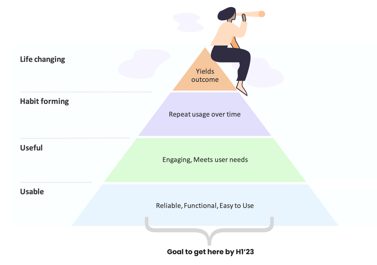
Our goal under the Product Quality OKR was to enhance usability, reliability, and functionality, laying the foundation for a product that’s both useful and life-changing.
To secure executive buy-in, I partnered with the VP of Product and proposed integrating Horizon’s adoption into the roadmap via a new Product Quality OKR. This initiative focused on enhancing end-to-end product usability, setting the foundation for creating habit-forming, life-changing products in the long term.
This strategic alignment tied Horizon directly to key business objectives, driving organization-wide adoption, and incorporating metrics like system uptime, task completion rates, accessibility, and design standards (see more on this in my Product Quality Case Study).
Establishing a system of governance

My internal strategy doc simplified access and highlighted the value of design systems.
As the design system matured, I focused on creating governance structures to ensure its long-term success:
Design critiques: Incorporated early feedback into templates for component variations.
Increased communications: Streamlined updates across leadership through a Design System strategy channel and regular updates.
Centralized documentation: Simplified access and usability with clear, centralized documentation. My internal doc supported the value of design systems and helped make the case for dedicated engineering headcount and roadmap space for prioritization.
Mentorship: Empowering growth
As the leader of a globally distributed team, I was deeply committed to fostering growth, collaboration, and mentorship.
Team growth & leadership: Over time, I strategically built the Design System team from scratch, hiring key first-time roles like dedicated design system product designers, and a content designer, as well as our first accessibility manager.
Coaching for success: Mentorship was a core part of my leadership approach. Ex: Mentored a Senior Product Designer through several roadshow presentations through writing scripts and rehearsing, helping them gain confidence and independence, leading to a promotion as a Lead Product Designer.
Collaboration across time zones: Ensured clarity and cohesion with regular check-ins and virtual team-building activities, using tools like Figma, Loom, and Slack to ensure the team felt connected.
Rolling up my sleeves: I led by example, contributing directly to design work when necessary, providing hands-on support to my team, and setting a tone of collaboration.
Leading distributed teams: Set clear expectations for communication and collaboration, while allowing flexibility. When working across time zones, embraced asynchronous workflows, recorded meetings, and created opportunities for everyone to contribute as needed.
Impact: Results that matter
The launch of the Horizon Design System led to celebratory measurable improvements in both product quality and team efficiency:
boost in design system adoption, driving organization-wide alignment and efficiency.
📈 72%
fewer accessibility issues thanks to fully WCAG-compliant components, enhancing inclusivity.
♿ 83%
cut in design time, empowering teams to prioritize strategic initiatives.
⏱️ 41%
acceleration in engineering development cycles, delivering faster product improvements.
⚡ 30%
reduction in design inconsistencies, contributing to a seamless brand experience across all platforms.
🎨 82%
Slack emojis sent to celebrate team wins and milestones.
🎉 1000
These results highlighted the system’s impact on improving efficiency, creativity, and user focus across teams. With a unified, accessible platform, students could now navigate Chegg with confidence—no longer hindered by inconsistencies or accessibility issues—leading to higher engagement and a more seamless learning journey.

After: The Horizon Design System utilized on Chegg’s main home screen using key components like cards, tabs, links and icons.
Leadership insights: Empowering teams through collaboration
Key takeaways:
🤝 Empathy & collaboration: Understanding team pain points was crucial to overcoming resistance.
🔄 Iterative improvement: Continuous feedback ensured the system evolved with changing needs.
🎯 Strategic vision: Aligning with business goals ensured long-term impact.
Leading the Horizon initiative reinforced my belief that successful systems are built on collaboration, empathy, and strategic alignment with business goals.
I’m passionate about fostering teams that grow together while creating exceptional design solutions. By empowering team members to take ownership and contribute their expertise, we built a design system that will continue to drive Chegg’s vision forward for years to come.